

Most companies invest heavily in making their websites visually impressive. Sleek animations, modern typography, and polished layouts are often seen as the standard. However, some of the highest-converting websites challenge this assumption by prioritizing function over appearance.
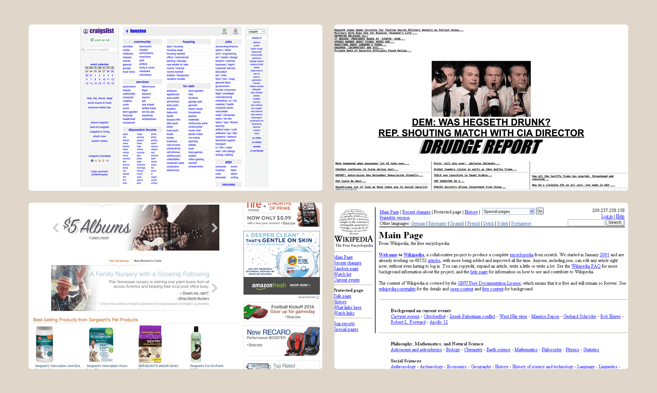
Platforms like Craigslist, Drudge Report, or early versions of Amazon are not considered visually refined by modern design standards. Yet, they perform exceptionally well because they focus on clarity, speed, and usability rather than aesthetics.
The Psychology Behind “Ugly” Websites
Across multiple projects and industries, it is not uncommon to see visually simple or even outdated websites generating significant revenue. While this may initially seem counterintuitive, deeper analysis through user research and performance data reveals clear patterns.
The success of these websites is not due to poor design itself, but rather due to how they align with user behavior and expectations. Key factors include trust, familiarity, and efficiency.
Familiarity builds trust
Users often associate overly polished or aggressive visual design with heavy marketing tactics, which can reduce trust. Simpler interfaces tend to feel more transparent and authentic, making users more comfortable completing actions.
Reduced decision fatigue
Complex and visually rich interfaces can overwhelm users with too many choices. Minimal and straightforward layouts help users focus on key actions such as purchasing or signing up.
Faster load times
Performance has a direct impact on conversion. Even small delays can lead to measurable drops in revenue. Lightweight websites with fewer visual elements typically load faster, helping retain user attention.
Function over form
Clear navigation, strong call-to-action buttons, and predictable layouts often outperform visually complex designs. Users prioritize ease of use over visual sophistication when completing tasks.
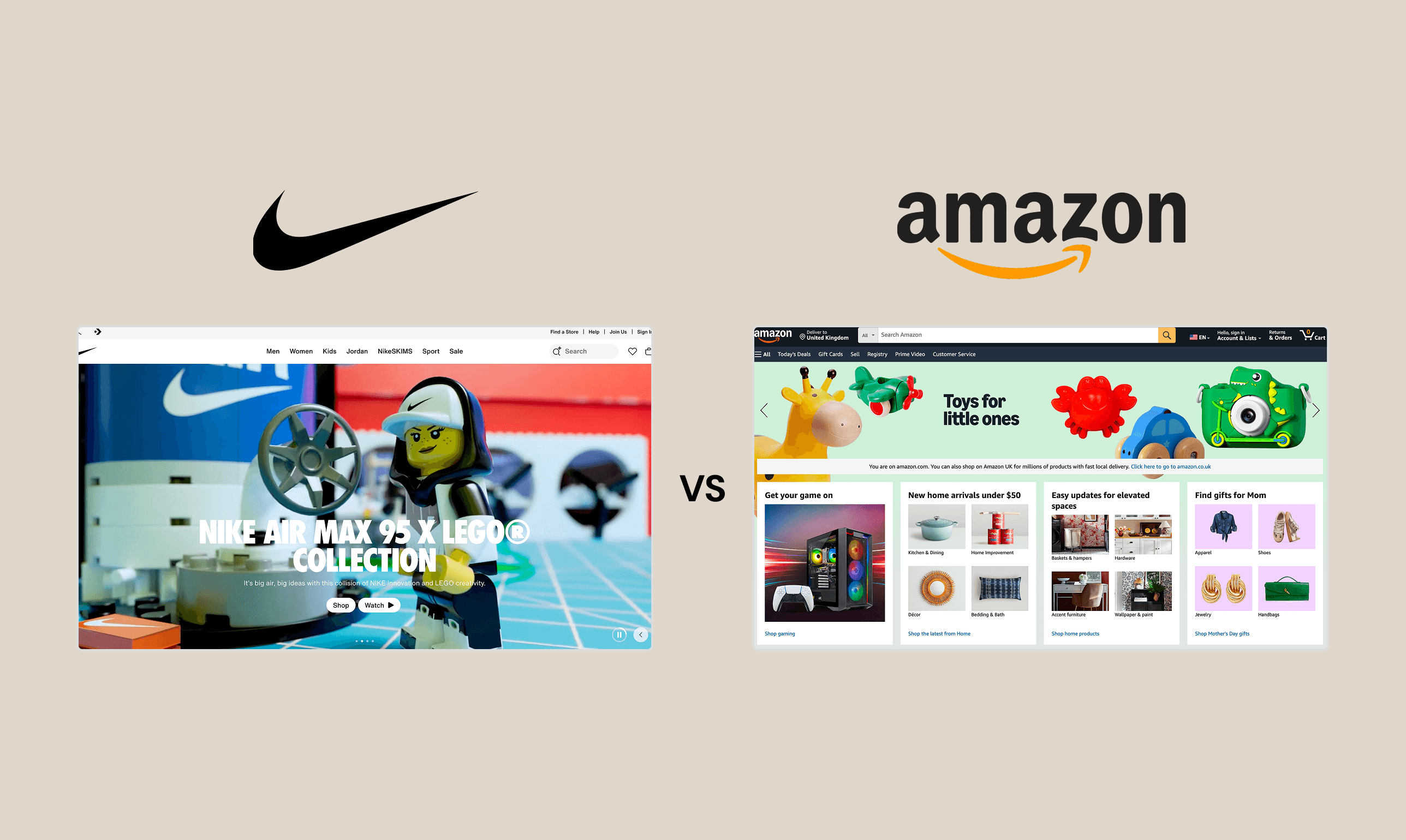
Nike vs Amazon: Different Strategies, Different Outcomes
A common misconception is that visually refined websites always perform better. Comparing Nike and Amazon illustrates why this is not the case.
Nike operates as a brand-driven company. Its website is designed to communicate lifestyle, emotion, and identity. Visual storytelling, imagery, and design aesthetics play a key role in influencing customer perception and engagement.
Amazon, on the other hand, operates as a marketplace. Its core value lies in logistics, product availability, and efficiency. The website is optimized for search, comparison, and fast decision-making. Emotional engagement is secondary to usability and performance.
Neither approach is inherently better. Each reflects the underlying business model and user expectations.
Finding the Right Balance
The goal is not to abandon good design, but to align design decisions with business outcomes. Conversion-focused design prioritizes usability, clarity, and speed while maintaining an appropriate level of visual quality.
Effective approaches include:
Using simple and high-contrast layouts that support readability
Prioritizing usability testing over subjective visual preferences
Ensuring every element serves a clear purpose
Optimizing performance by reducing unnecessary visual weight
A website should not be treated as a purely visual asset. It is a business tool designed to guide users toward action. While strong design contributes to credibility, performance and usability remain the primary drivers of conversion.


